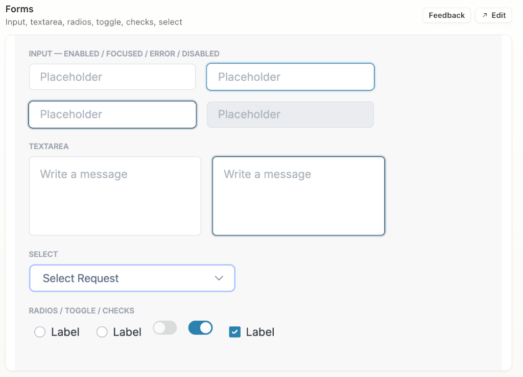
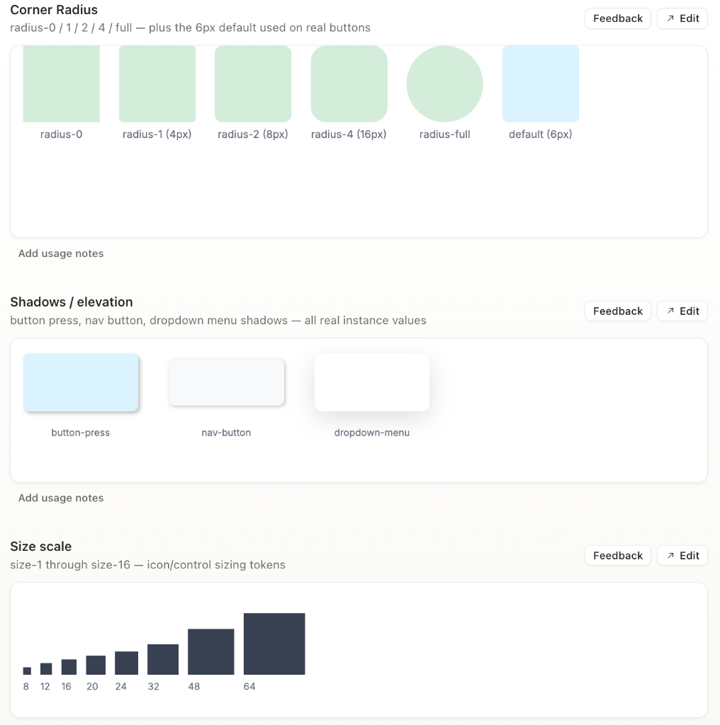
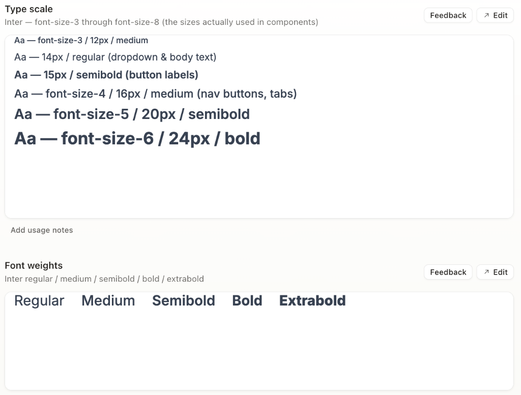
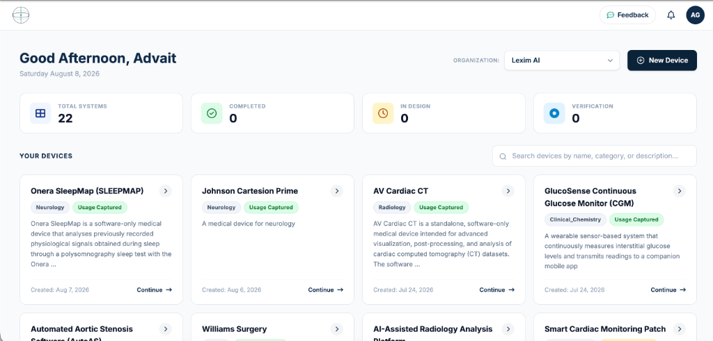
The startup moves fast — agile, lean team, shipping constantly. As the sole designer, I couldn't be hands-on with every screen, so a lot of implementation for redesigns and new features was handled directly by developers, pulling loosely from a generic Bootstrap kit in the absence of a shared system. That speed came at a cost:
One feature redesign took a minimum of one full work week. For a startup running regular investor and customer meetings, that pace wasn't sustainable.
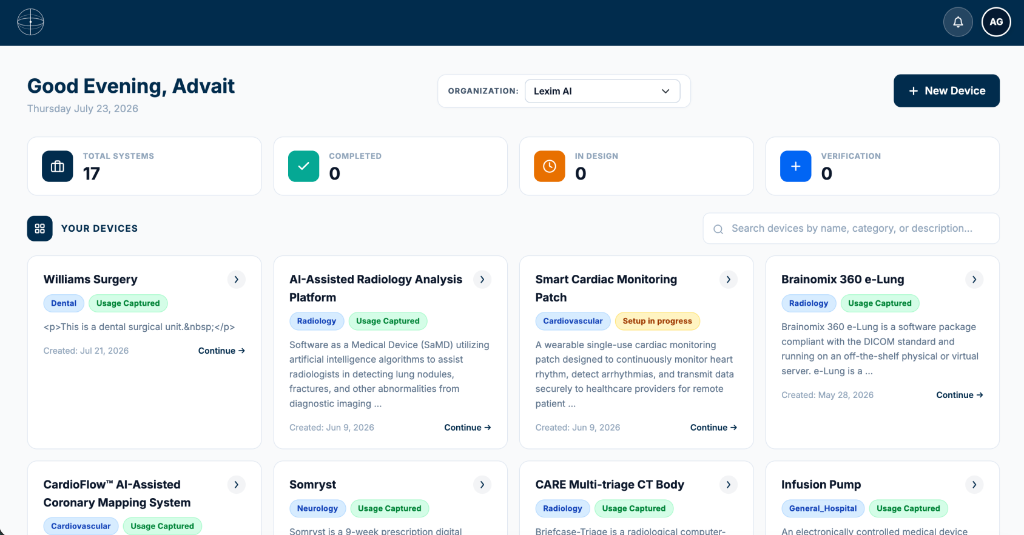
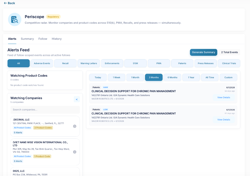
TWO DIFFERENT PRODUCTS, TWO DIFFERENT DESIGN LANGUAGES
Audit first. I started by mapping what already existed — keeping what worked, flagging what didn't — rather than rebuilding from scratch.
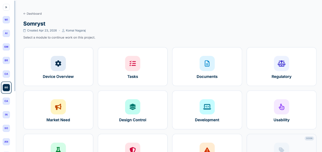
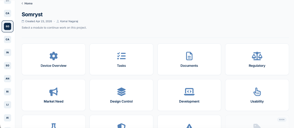
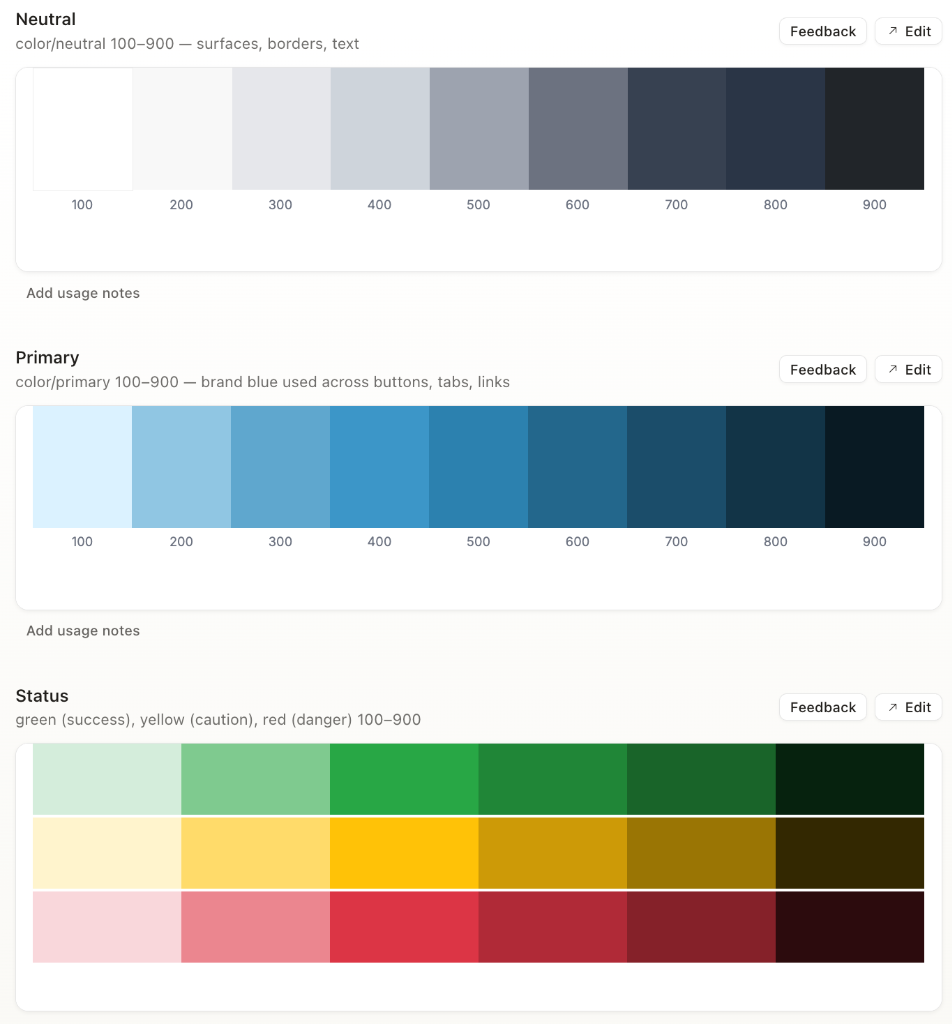
Tokens before components. I built on top of foundational tokens laid down by a collaborator (Charles Meng), then defined clear use cases for each — e.g., light primary reserved for hovers and strokes, dark primary for forward navigation fills and primary button strokes. Nothing arbitrary; every token had a job.
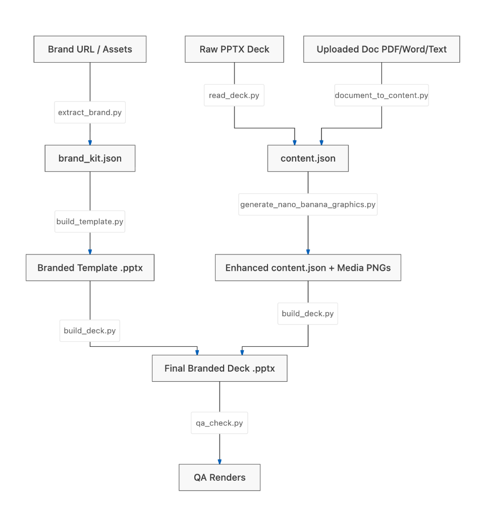
Design system into production, not just Figma. Once the system was solid, I loaded it into Claude Design to generate on-system redesigns rapidly, then handed the same system to the dev team so they could build directly from it using Claude Code — turning it from my reference into a shared one.


Early on, there was a genuine design debate about how much color the product should use. My CEO was drawn to a bolder, color-forward direction. I advocated for the opposite: a 90% neutral, 10% primary/secondary/semantic system.
The reasoning: if color is used for everything, it stops meaning anything. Reserved for state, action, and alerts, color actually communicates something to the user — and gives the product the mature, trustworthy feel expected of a B2B regulatory platform.
Making that case meant backing the recommendation with reasoning a design system needs to hold up under real use, not just aesthetic preference — and it's the decision I'd point to as the clearest example of systems-level thinking in this project.

BEFORE

AFTER

BEFORE

AFTER

As the sole designer on a team of engineers, I was in a unique position: the one person whose day-to-day was to think about consistency, hierarchy, and how color and structure communicate meaning to a user. That perspective isn't something a team naturally arrives at without someone advocating for it. No one had asked me to build a system; I saw where the product was headed and made the case for it myself.
Driving that from idea to something the whole team could build from took judgment, clear reasoning, and follow-through, translating a point of view into a system, then making sure it outlived me by putting it directly into the tools the team already used.