How a flat, unstructured feed requiring self-led digging was redesigned into a scannable dashboard featuring categorized activities and actionable AI summaries.
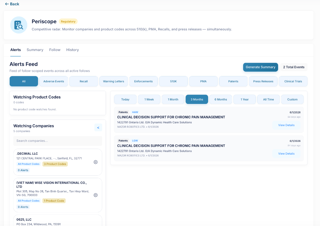
BEFORE: Flat & Unstructured Feed
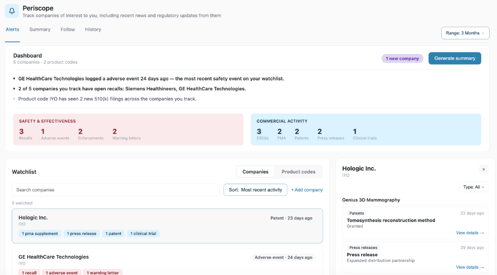
AFTER: Categorized Watchlist & AI Dashboard
Regulatory affairs professionals in the medical device industry operate in a high-stakes, high-information environment. They need to monitor competitor clearances, clinical trials, and recalls to protect their market share and maintain compliance.
The original version of the Periscope dashboard listed all competitive and regulatory actions in a flat, chronological feed. It offered no high-level overview or automated classification, requiring users to click through every single card. This self-led experience created a steep learning curve that threatened customer acquisition.
As the sole designer, the challenge was to completely reimagine the interface—re-architecting how regulatory data is organized, integrating agentic AI summaries, and coding the frontend for rapid developer integration.

Without prior domain expertise in medical device regulatory frameworks, I took the initiative to run deep-dive sessions with our CPO and prospective clients. I focused on understanding how regulatory officers prioritize incoming news.
1. Risk vs. Growth: Regulatory events are not created equal. A warning letter or product recall is a critical threat that demands immediate action. A competitor's patent filing or 510(k) clearance, while important, is commercial intelligence for strategic planning.
2. Scalability Bottlenecks: While early customers tracked only a handful of competitors, larger enterprises needed to track hundreds of companies and product codes. The interface had to scale gracefully from low-volume to high-volume monitoring.
To address these insights, I restructured the application layout, moving from a single feed to a tiered information architecture:
I categorized all incoming alerts into two high-level channels:

BEFORE: Flat category pills feed where a wide range of different alerts and events were shown in the same format, offering no visual hierarchy between risk and growth.
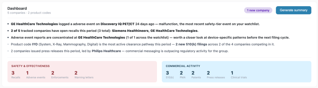
AFTER: Dashboard Counters — Red warning counters for Safety vs. Blue indicators for Commercial Activity, establishing clear visual hierarchy for risk vs. growth metrics.
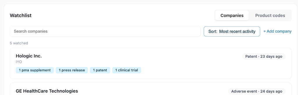
AFTER: Watchlist Badges — Status badges on watchlist cards reflecting their respective high-level categories to allow rapid scannability during feeds monitoring.
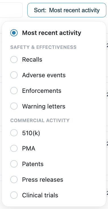
AFTER: Interactive Sort Dropdown — Sort dropdown grouping activities. Sorting pushes zero-activity companies to the bottom rather than omitting them, preserving complete data oversight while saving real estate.
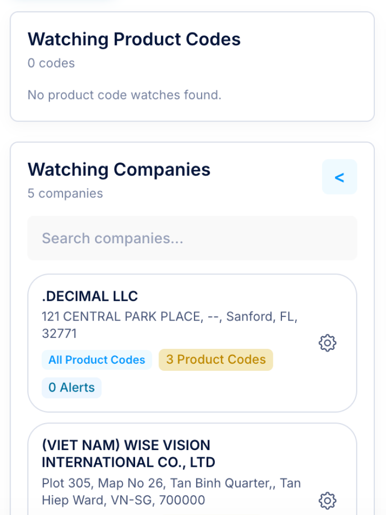
To support scaling to thousands of tracked entities, I introduced a tabbed Watchlist layout separating "Companies" and "Product Codes" to segment data naturally.

BEFORE: Single Screen Stacking
Both product codes and companies displayed on the same screen, which was not scalable for customers tracking hundreds of entities.

AFTER: Tabbed Layout
A tabular system allowing codes and companies to each have more screen real estate, which users can easily scan to identify what they need.
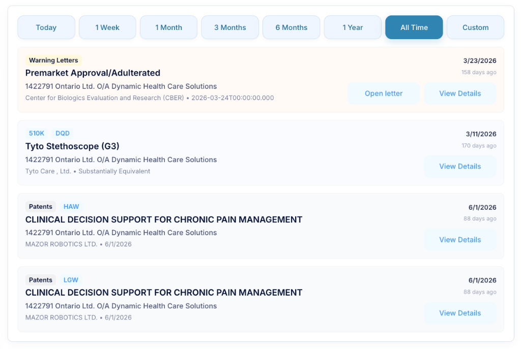
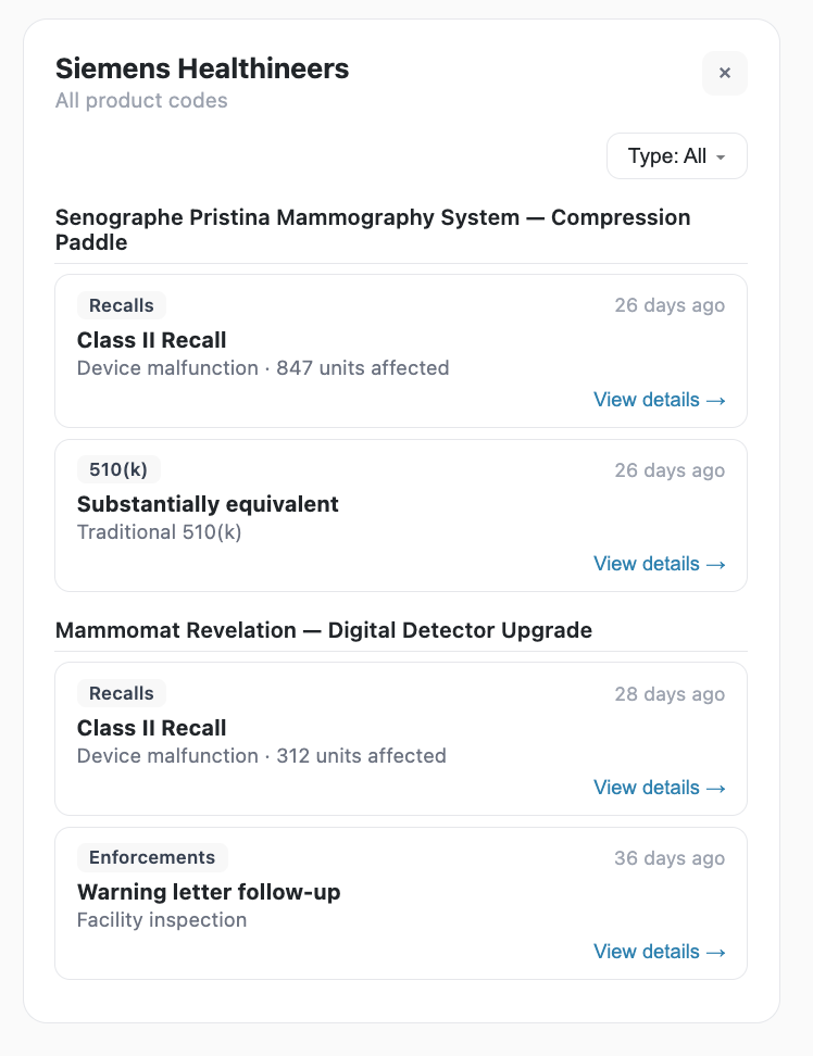
I also resolved a major pain point in the old feed where identical patents or device updates with multiple filings were listed repeatedly. In the new design, each device or patent is listed once, with all subsequent activities nested chronologically underneath, instantly clearing out interface noise.

BEFORE: Redundant alert items

AFTER: Clean, nested device timeline
A major product concern was the scaling of dashboard news summaries. Since different users follow different sets of companies, the dashboard news had to remain relevant and structured regardless of watch volume.
I collaborated with the CPO to consolidate user needs into a set of 3–5 core system prompts for our agentic AI. I wrote these prompts applying UX writing frameworks—specifying structure, tone, and clinical accuracy—to ensure the AI agent extracts the three most critical, actionable bullet points at the top of the dashboard. This baseline of prompts ensures consistent quality during testing before pushing to production.
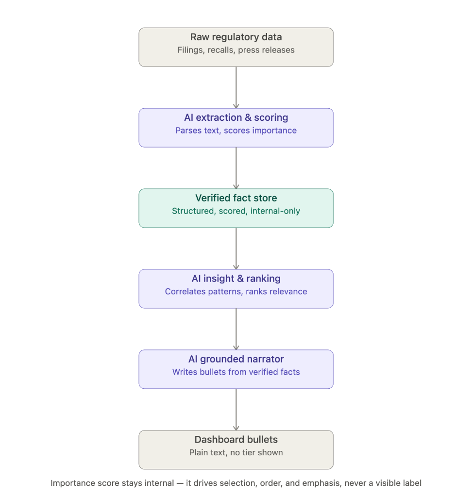
Rather than relying on a single, monolithic "write me a bullet" prompt—which introduces high hallucination risk and is fragile to scale—we designed a modular **Multi-Stage Prompting Pipeline**. By separating raw document extraction, verified fact stores, ranking logic, and narration into distinct, bounded stages, we contained hallucination risks, decoupled business configuration (our importance table) from language generation, and ensured every summary is fully auditable down to its source filing.
These news bullets let users grasp key updates in seconds, with the option to click any category number in the dashboard's red or blue sections to instantly drill down into the details.

AI-powered news bullets aligned with interactive category numbers for quick drill-down workflows
AI Prompting Pipeline Architecture — By isolating raw extraction, fact storage, ranking, and final narration into separate stages, the system contains hallucinations, decouples business rules, and supports full auditability back to raw filings.
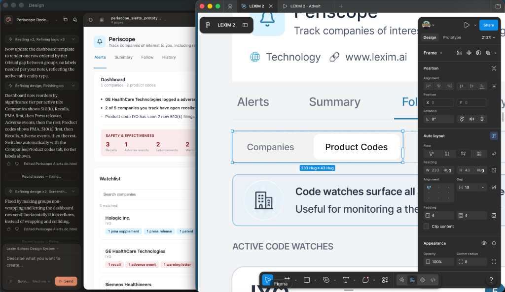
Being the sole product designer at the startup means owning the entire delivery loop—from strategic concept to working code. Rather than hand-coding every line from scratch, I leveraged modern developer tools to multiply my velocity:

Rapid prototyping workflow: Synchronizing Figma components with AI-generated frontend code side-by-side
The code has been successfully pushed to dev. I am currently partnering with our backend engineer to test the agentic AI’s live behaviors—specifically verifying that the LLM's summaries match the prompt structures and maintain low-latency responses.
For validation in the dev environment, we are tracking user interaction flows and clicks on the dashboard, followed by qualitative user interviews to evaluate cognitive load and setup ease.