How an unreadable, misaligned wall of plain text was redesigned into a high-density, interactive comparison engine—featuring collapsible category accordions, verifiable regulatory citations, and context-grounded conversational AI.
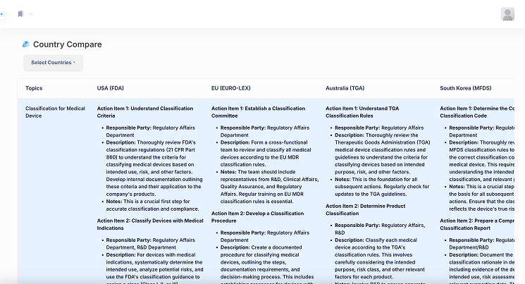
BEFORE: Misaligned Wall of Text
Disparate paragraph lengths broke vertical row alignment during scroll, causing severe cognitive overload and comparison failure.
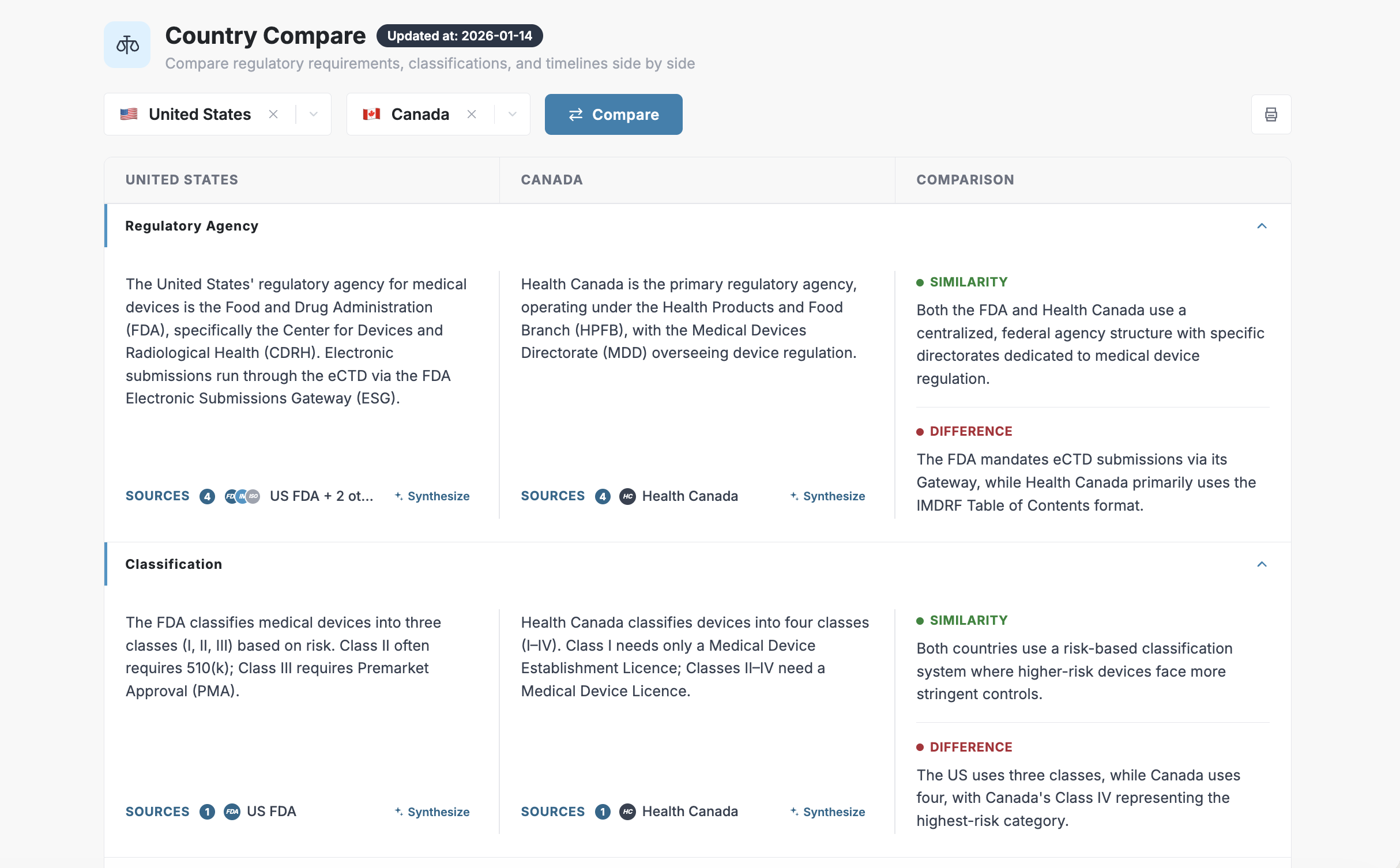
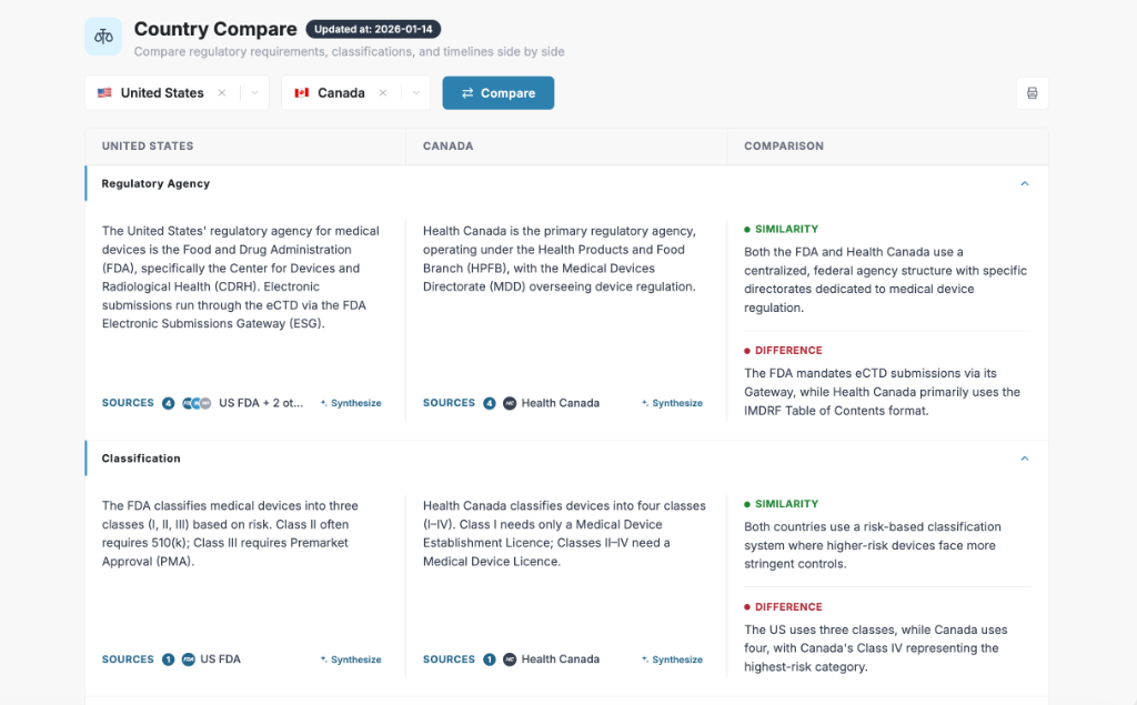
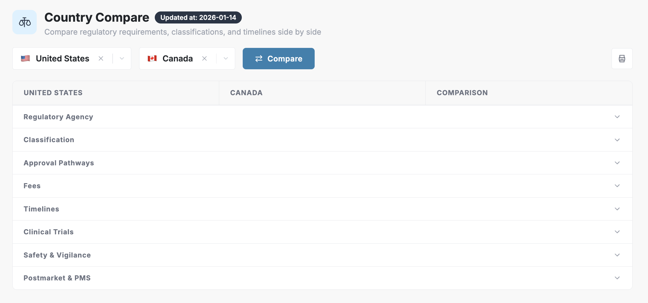
AFTER: Structured Comparison Matrix
Collapsible category rows with synchronized heights, dynamic similarity/difference callouts, source pills, and AI synthesis.
In the medical device and life sciences industry, entering a new international market requires thorough side-by-side regulatory comparative analyses. Strategy teams, regulatory affairs officers, and legal counsels must cross-examine jurisdictions—such as the United States (FDA) vs. Canada (Health Canada) or the EU (EMA)—across pivotal facets: Regulatory Agencies, Risk Classifications, Filing Fees, Clinical Trial Protocols, and Approval Timelines.
However, our initial product version failed to deliver effective comparison:
Asymmetric paragraph heights caused rows to slip out of alignment during vertical scrolling, breaking direct side-by-side comparison across jurisdictions.
A continuous, uncollapsible wall of plain text triggered visual fatigue, burying actionable intelligence underneath dense paragraphs.
Clinical leads, regulatory officers, and legal counsels care about different categories. An unsegmented feed forced everyone to read everything.
In high-stakes regulatory decisions, ungrounded AI summaries pose dangerous liability. Users demanded instant, primary statutory citations.
As the sole product designer, my mission was to rethink the entire experience: consolidate massive regulatory density into a scannable, single-viewport workflow, engineer rock-solid trust mechanics, and embed contextual conversational AI.
Before transitioning into a custom web UI, the early pipeline required rendering comparisons inside raw Markdown documentation files. Traditional Markdown tables are fundamentally rigid: multi-line paragraphs break table syntax, and native collapsibility does not exist.
Rather than waiting for a full backend rewrite, I innovated within the constraint:
By encapsulating each comparison category inside semantic <details> and <summary> tags, we achieved accordion behavior that maintained structure even in headless documentation environments. This architectural breakthrough validated the mental model of on-demand progressive disclosure before writing a single line of production UI code.
Once proven, I partnered closely with our frontend engineer to translate this paradigm into a rich, scalable React and HTML/CSS component system, co-authoring production-ready code with Claude to rapidly accelerate delivery.
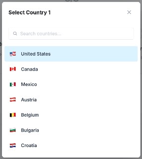
As we scaled our capabilities and the amount of countries we supported, we needed a modal that was easy to scroll through, scan, and easy to search.
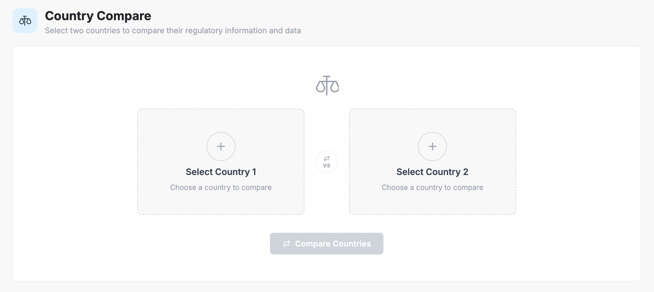
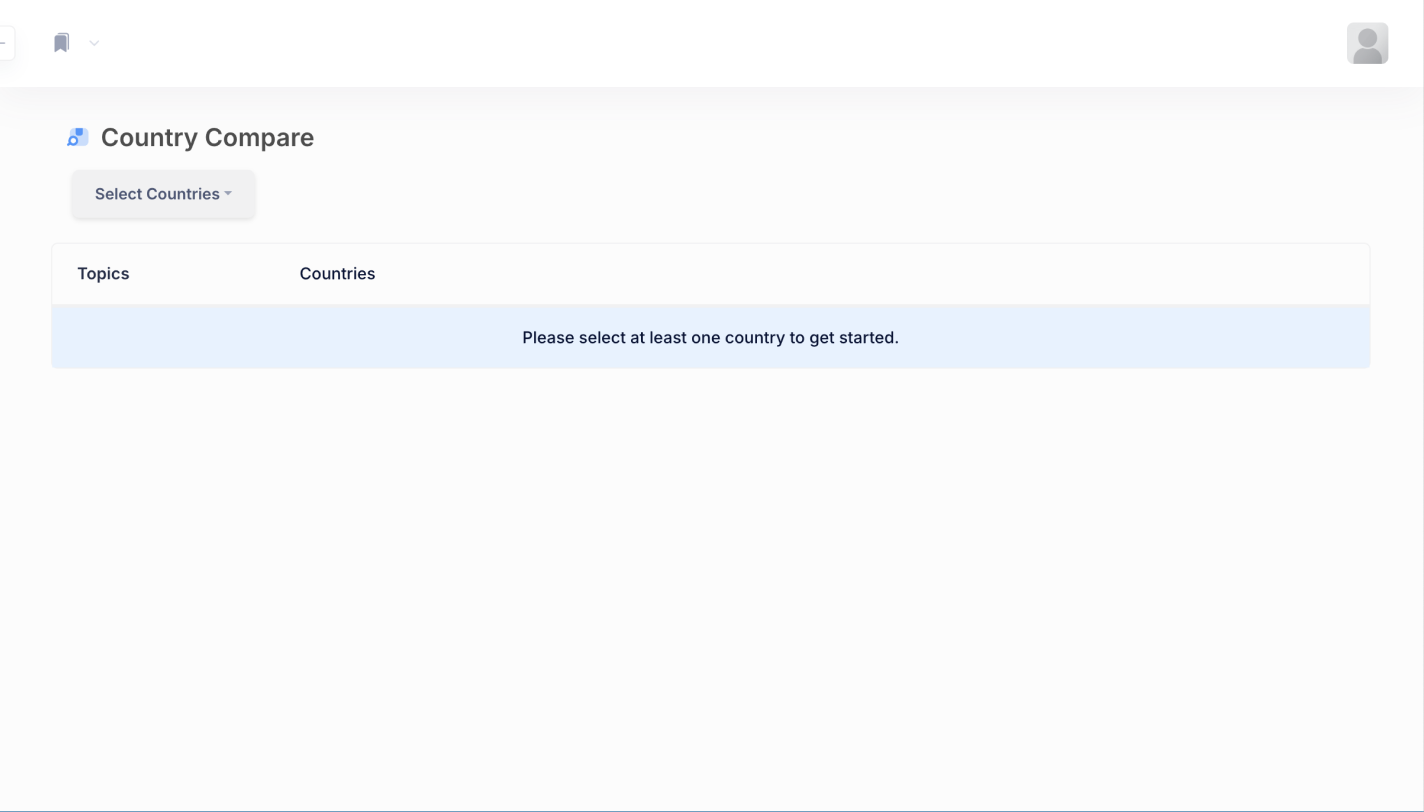
BEFORE: Bare Prompt & Ambiguous CTA
A static empty table stating "Please select at least one country to get started," leaving first-time users guessing.
AFTER: Guided Dual-Card Launchpad
Balanced comparison cards with a clear mental model, interactive addition targets, and zero initial barrier to entry.
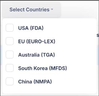
BEFORE: Unsearchable Checkbox Dropdown
Text-only dropdown limited to a handful of pre-set countries without search or regional grouping.
AFTER: Searchable Flag-Indexed Modal
Typeahead search, national flag iconography for instant visual recognition, and clean keyboard accessibility.
The defining architectural innovation was restructuring comparison rows into an independent collapsible accordion matrix.
By encapsulating each regulatory subject (Regulatory Agency, Classification, Fees, Timelines, Clinical Trials, Vigilance) into an independent card row, paragraphs are visually anchored. Even if Country A's filing process requires 400 words while Country B's is 30 words, the bottom boundary remains locked to the next category row—guaranteeing 100% horizontal alignment.
In the new design, expanding any category reveals a dedicated three-column matrix:
+ Synthesize trigger.Instead of forcing users to scroll through miles of dense documentation, users can collapse completed or non-applicable topics with a single click. When collapsed, the entire regulatory landscape across all 8 essential categories fits comfortably within a single desktop viewport, giving users total control over visual density.
In legal and life-sciences regulatory software, trust is paramount. An AI summary that cannot be audited against an authoritative legal statute is useless to an enterprise regulatory director facing million-dollar submission deadlines.
I designed a multi-tiered citation architecture that bridges AI synthesis directly to primary legal source documents:
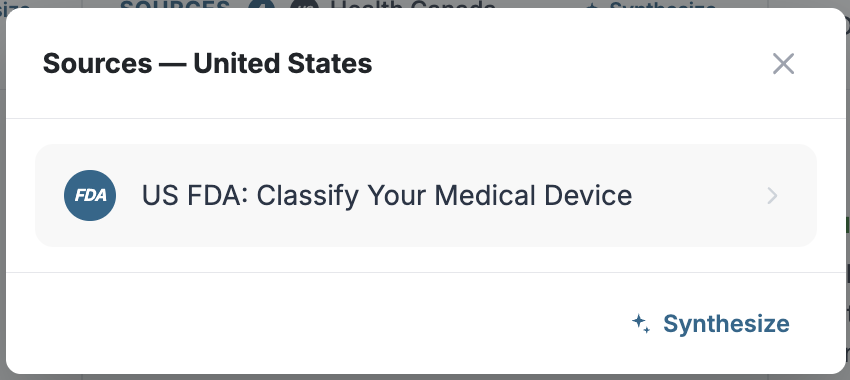
At the footer of every comparison card, users see explicit agency badges (e.g., FDA, Health Canada, ISO, IMDRF) and a count of active reference documents. Clicking any source tag summons a dedicated modal displaying exact source guidance.
Dedicated Source Drawer: Provides direct hyperlinks to the underlying statutory guidance (e.g. US FDA: Classify Your Medical Device), enabling legal teams to audit the data in seconds.
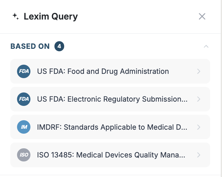
Multi-Source Grounding: Shows transparent indexing across ISO 13485, IMDRF, and federal registers, ensuring zero ungrounded hallucinations.
Standard AI chatbots in enterprise software often fail because they are detached floating widgets. Users must copy-paste text, reiterate context, and hope the bot does not confuse the jurisdiction.
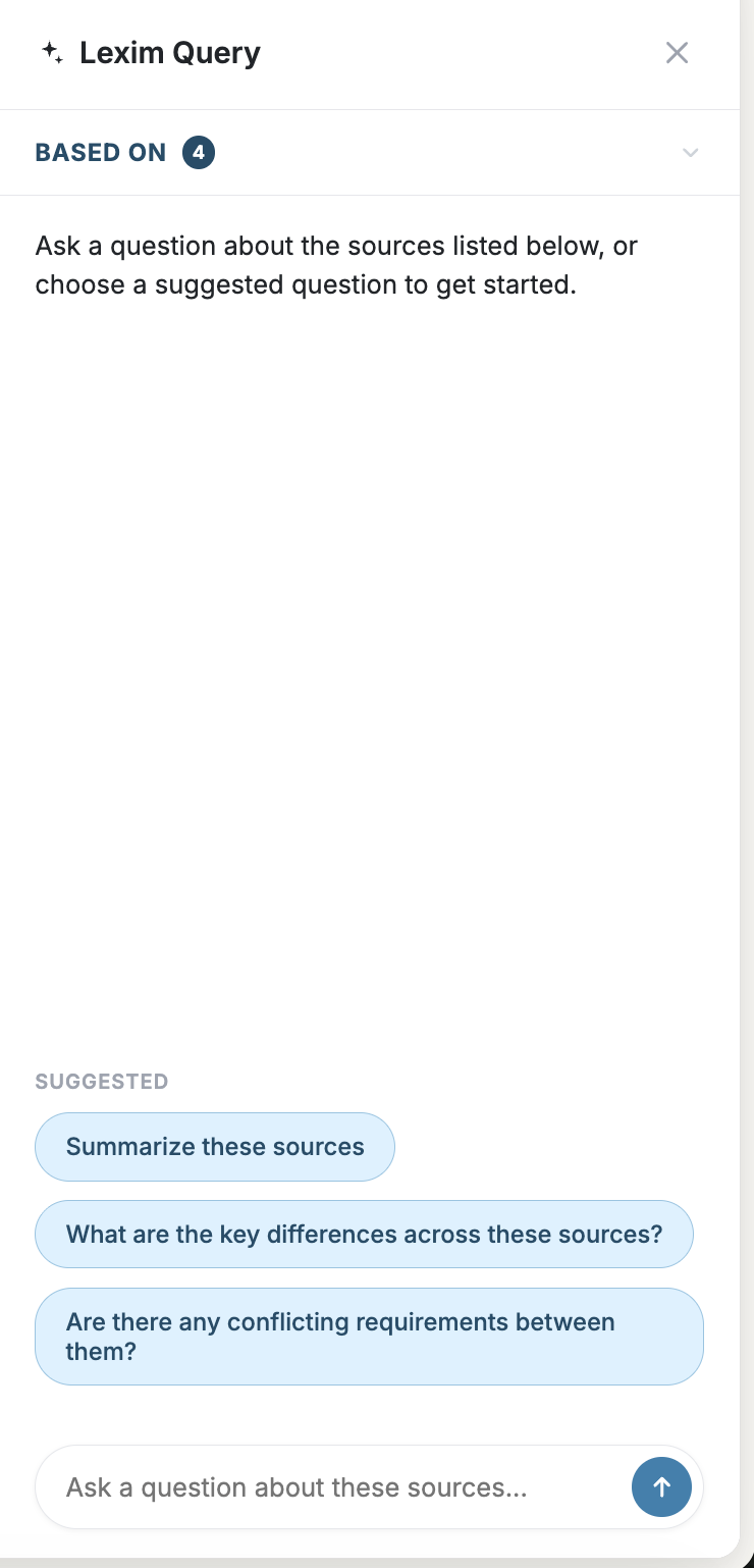
I architected Contextual AI Query as an inline, section-scoped conversational partner:
Regulatory specialists do not want generic chatter—they need definitive confirmation on statutory ambiguities. By tethering the AI Query assistant to the exact source nodes of the active matrix row, the system acts as an interactive audit partner rather than an unverified oracle.
"Instead of having to copy text into an external chat window and verify its hallucination risk, users query the exact legal citations right at the point of comparison."
1. Density Without Overwhelm: Enterprise users do not need information stripped away—they need information structured. Collapsible accordions transformed an exhausting vertical scroll into an interactive command center that adapts to each user's job-to-be-done.
2. Designing for AI Trust: In high-stakes legal sectors, explainability and citations are not secondary UI niceties; they are core product requirements. Giving users the power to verify sources and chat directly with cited documents turned AI from a liability into a superpower.
3. The Prototyping Advantage: Solving the early Markdown table constraints with HTML details tags allowed us to validate the interaction model long before full frontend implementation. Writing the production HTML in lockstep with engineering bridged design intent and execution without compromise.